A functional energy drink given the restraint of a luxury object. BeBest Energy brings identity, packaging, motion and commerce together around one thought: every stronger version of you begins as a reflection.
- Client
- BeBest Energy
- Role
- Brand identity, art direction, UX/UI & development
- Timeline
- 2026
- Team
- Independent end-to-end project
- Live site
- bebestenergy.com ↗
- Stack
- Astro 6Tailwind CSSGSAPServerless CheckoutVercel
Energy without the visual noise
The energy category is built to compete at a glance. Most brands answer with brighter cans, harder claims and increasingly aggressive visual language. BeBest needed to communicate performance without joining that noise — premium enough to feel considered, functional enough to feel credible and human enough to belong in a daily routine.
The challenge was larger than designing a website around a finished product. The identity had to work as a small monogram in navigation, a confident mark on a 330 ml can, a campaign system at billboard scale and a clear commercial interface in two languages. Every part needed to feel like the same brand before a customer read a single ingredient.
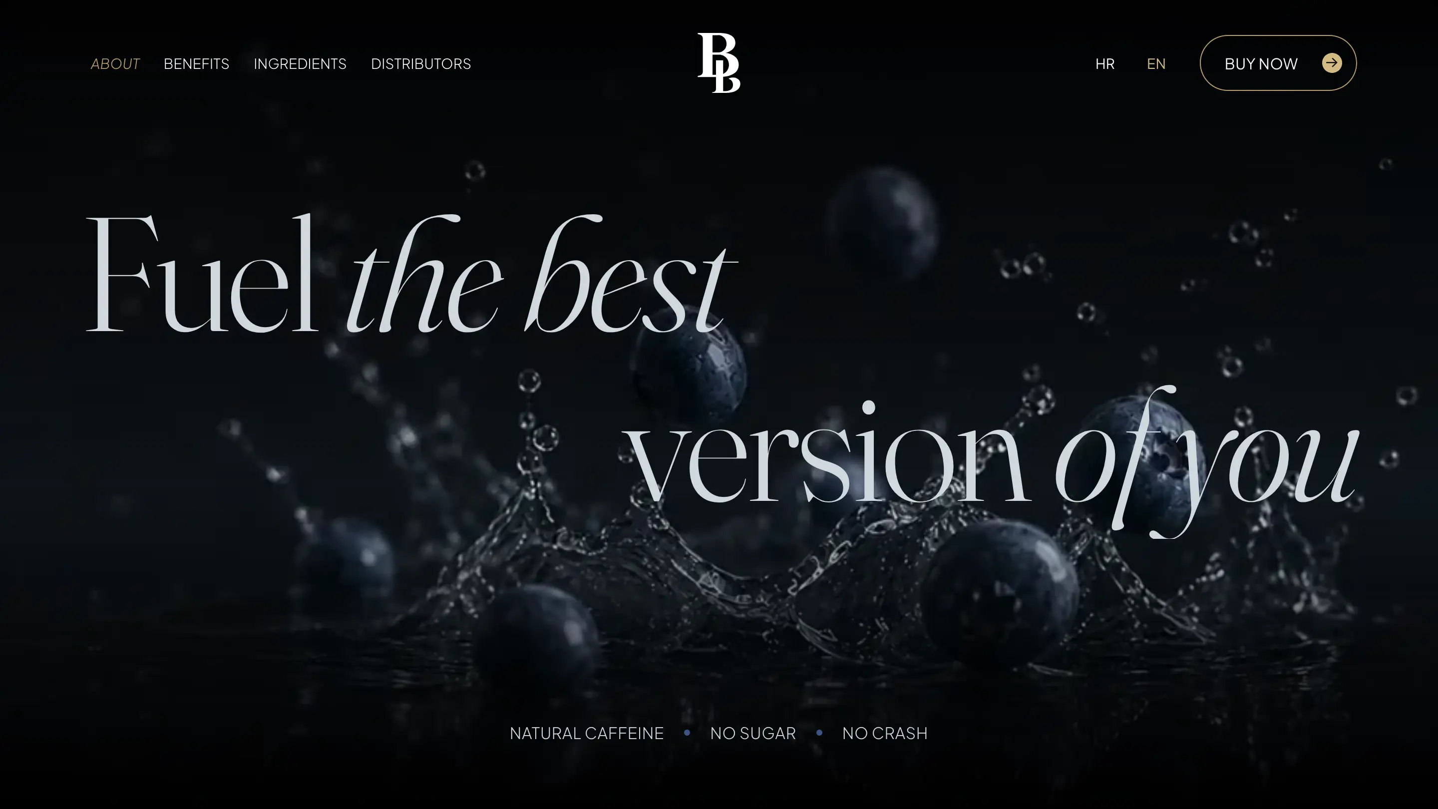
Turn self-improvement into a visual system
The line ‘Fuel the best version of you’ gave the work its centre. Instead of treating it as campaign copy, I used it to shape the entire brand: one version meeting another, present effort meeting future potential, product meeting reflection.
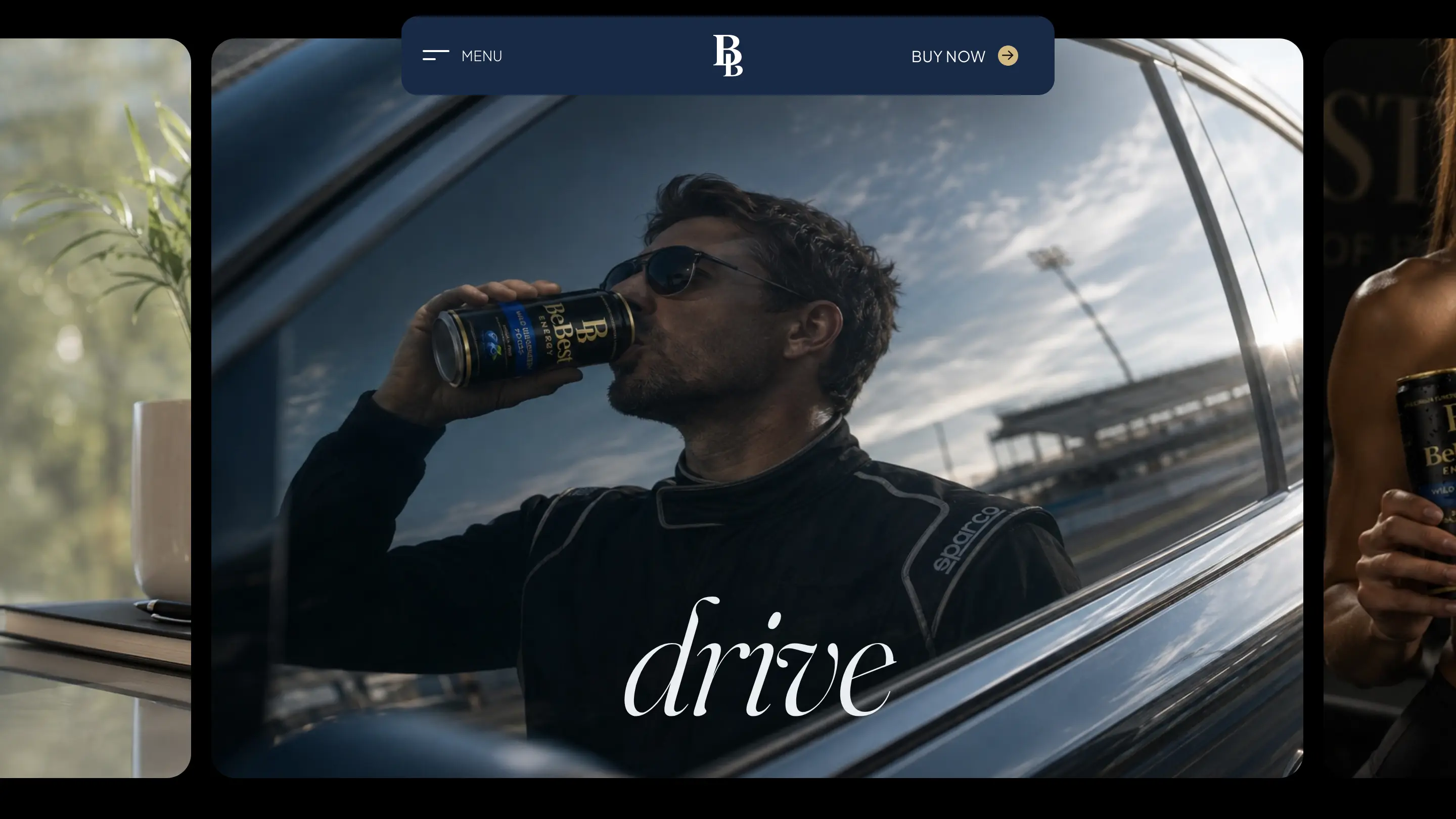
That idea allowed performance to be expressed with control. The tone stays ambitious but never frantic. The audience expands naturally from training to work, long drives and demanding days, while the product remains the same calm object at the centre of every scene.
The logo balances before the brand moves
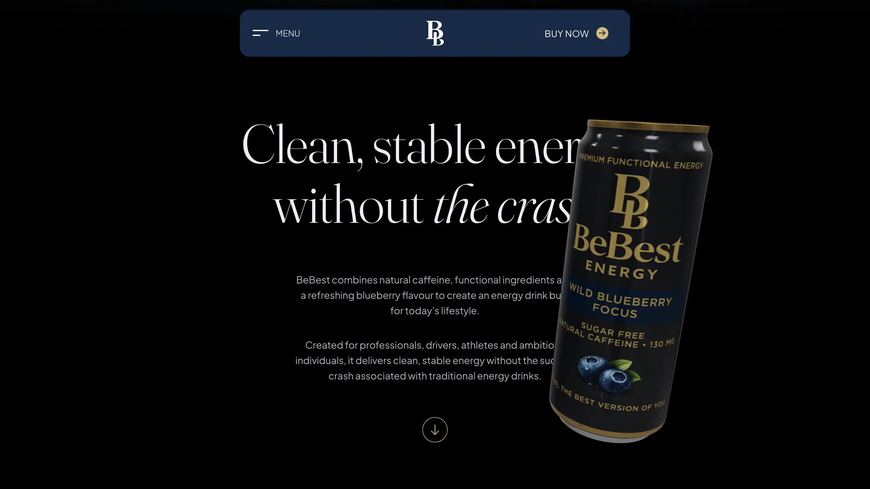
The BB monogram is constructed around a shared vertical axis. Two closely related letterforms meet as a compact, symmetrical sign: Be and Best held in the same structure. The repetition reads as progress rather than duplication — the first state becoming the second without losing itself.
That symmetry gives the identity practical range. The monogram remains recognizable when the full name disappears, holds its own on the narrow face of the can and becomes a quiet anchor inside navigation. Gold turns the mark into a point of light, while the black and navy fields give it enough silence to feel assured rather than ornamental.
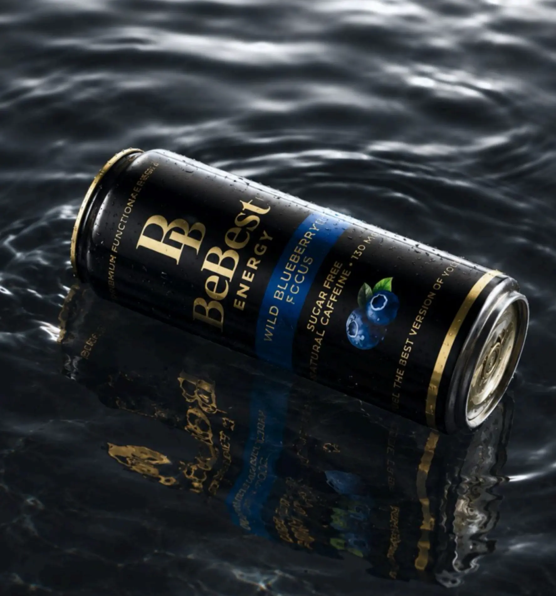
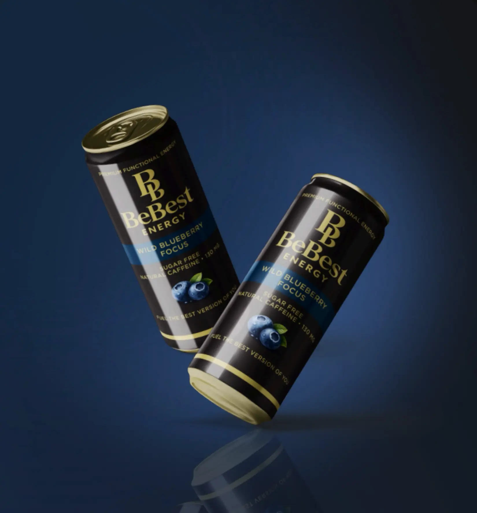
Reflection is not an effect. It is the idea.
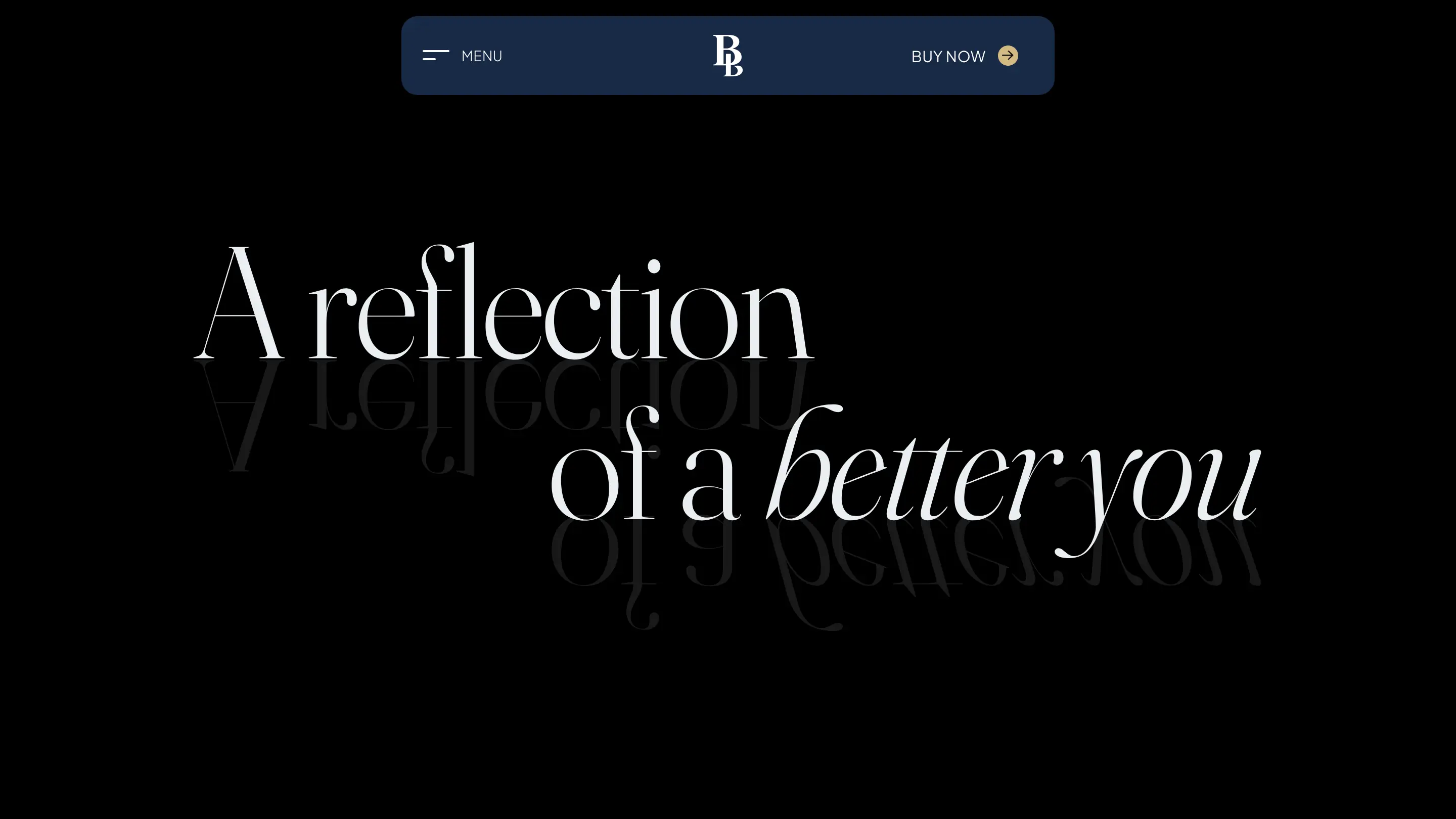
Reflection became the connective tissue between identity, photography and interface. Sometimes it is literal: a can meeting the water below it, typography folding across an invisible horizon, a second product hovering beneath the first. Sometimes it is conceptual: the person you are today facing the version you are working toward.
Because the device comes from the brand promise, it can repeat without becoming decoration. It gives still imagery movement, makes black surfaces feel dimensional and creates a recognizable atmosphere even when the logo is small. The symmetry of the monogram and the symmetry of the reflection speak the same visual language.
Night, metal and one measured gold
Energy Black creates the immersive canvas; Blueberry Navy carries flavour, focus and cooler depth. BeBest Gold belongs to the identity itself, while Soft Gold is allowed to come forward for actions and selected states. Silver Mist keeps long-form information clear, and Soft Black separates controls and cards without breaking the dark atmosphere.
- Energy Black#000000
Primary ground and dark media canvas
- Blueberry Navy#182946
Panels, cart, artwork and alternate grounds
- BeBest Gold#BBA067
Identity, borders, links and selection
- Soft Gold#D3BA83
Calls to action, icons and active details
- Silver Mist#EAEEF2
Headlines and primary body copy
- Soft Black#131313
Cards, controls and elevated surfaces
The gold is deliberately rationed. When every detail tries to look premium, nothing does; its value comes from appearing only where the brand speaks or the interface asks for action.
Editorial energy, not shouting
Fraunces gives BeBest the expressive range of an editorial serif rather than the bluntness expected from an energy drink. Its light display cuts and italic shifts create softness, contrast and reflection inside the headlines. Plus Jakarta Sans takes over wherever the brand needs precision: ingredients, navigation, prices, forms and the entire purchase journey.
Hero statements, section headings, product titles and editorial contrast
Body copy, navigation, labels, buttons, forms, prices and product detail
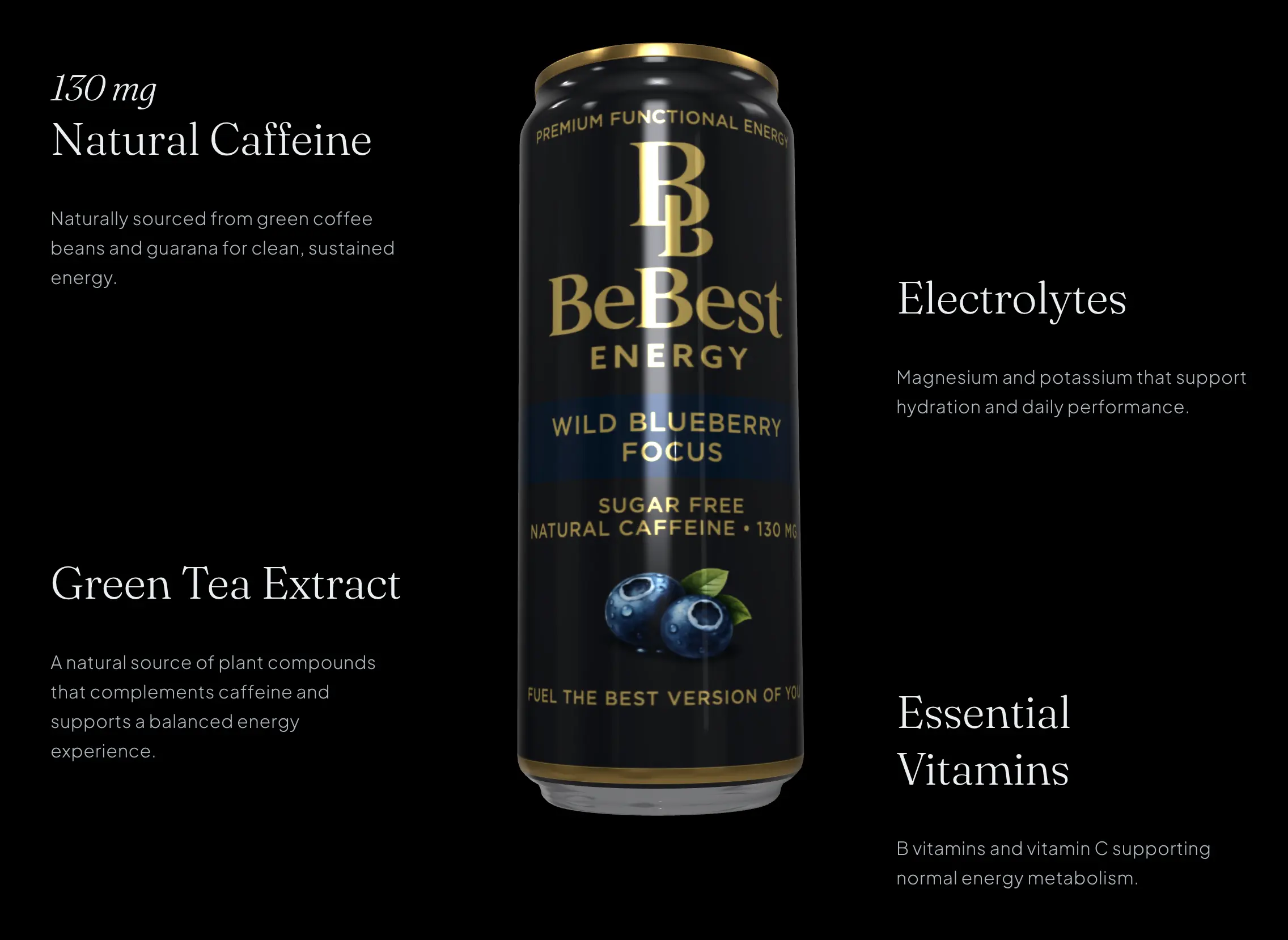
Let the atmosphere sell. Let the shop stay simple.
The editorial homepage is designed to create desire, but the webshop has a different responsibility: answer practical questions and remove friction. The product page brings pack size, price and add-to-cart forward, then supports the decision with ingredients, nutrition, delivery options and a concise FAQ.
A persistent cart connects the two modes without forcing the entire website to look transactional. The drawer keeps quantities, delivery and age confirmation close at hand; Croatian and English routes preserve the same hierarchy; and the checkout endpoint turns the immersive brand surface into a complete purchase path.
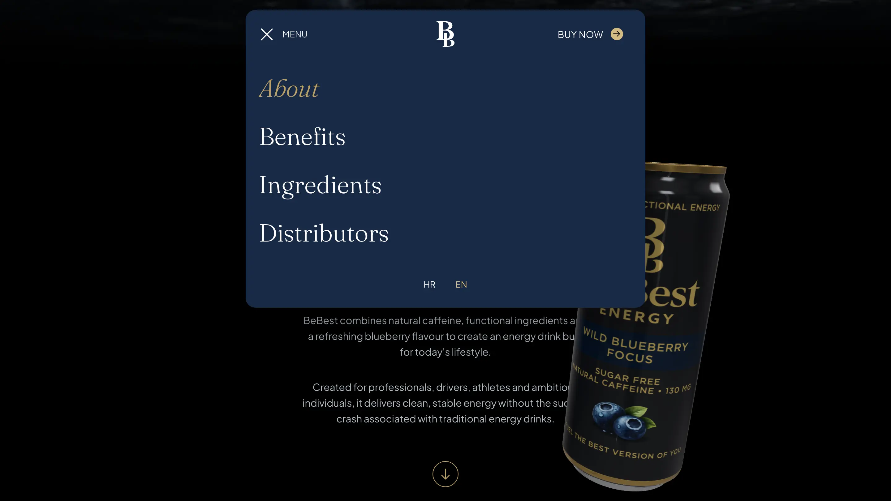
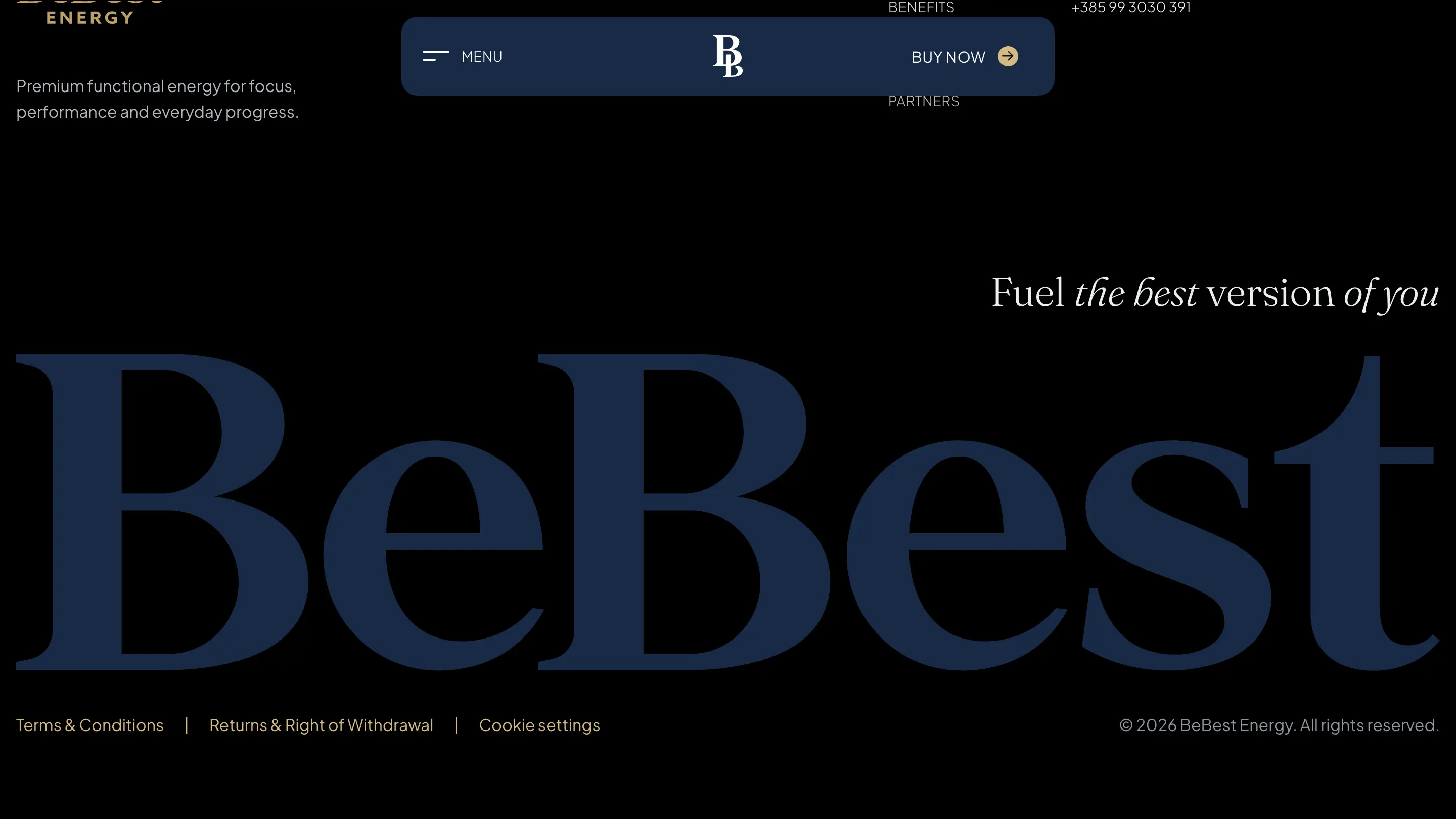
The product stays the hero.
On mobile, the same system becomes more immediate: product first, navigation within reach and the brand promise carried through every narrow composition.
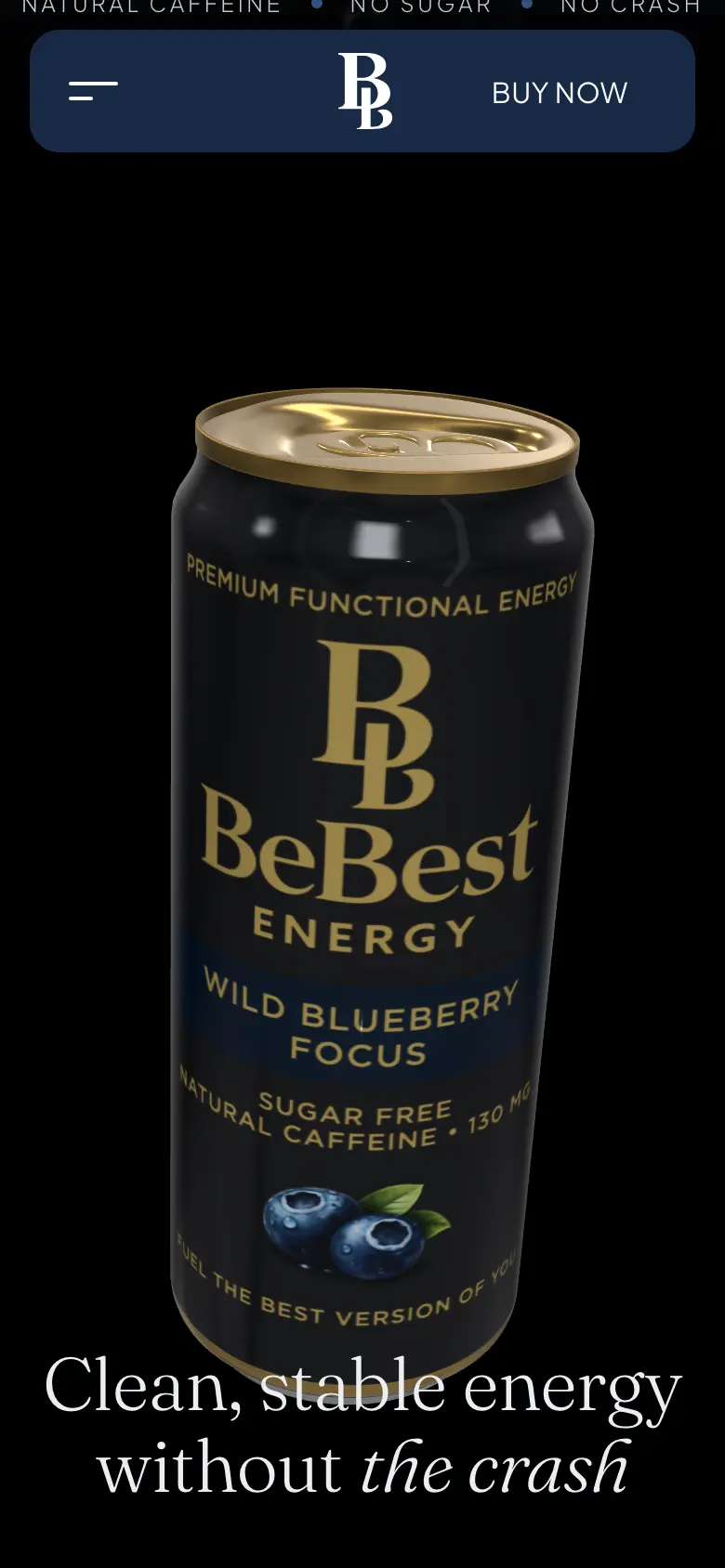
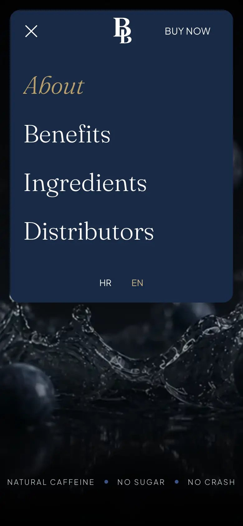

“The reflection is not there to make the product look expensive. It makes the promise of becoming better visible.”
Marko Malec

One idea, carried all the way through
BeBest now has more than a visual style. It has a repeatable brand behaviour: symmetry in the mark, reflection in the image world, restraint in the palette and editorial contrast in the typography. Those decisions connect the can, the campaign and the interface without making them mechanically identical.
The website completes that system rather than simply displaying it. Brand story, functional benefits, distributor interest and direct-to-consumer commerce live inside one coherent experience — giving a new product the presence of a brand that already knows exactly what it wants to become.