Twenty years around combat sports, six years of coaching and one direct promise: arrive as you are, leave a little stronger. Muha Balboa turns that attitude into a focused digital home for a trainer and the Ghetto3D boxing team.
- Client
- Muha Balboa / Ghetto3D
- Role
- Creative direction, design & development
- Timeline
- 2026
- Team
- Independent project
- Live site
- muhabalboa.com ↗
- Stack
- Astro 5ReactTailwind CSSGSAPVercel
A fighter’s confidence without the usual gym clichés
Combat-sports websites often reach for the same shorthand: fluorescent accents, anonymous athletes and promises shouted in all caps. Muha’s reputation was built differently — through time in the sport, direct coaching and a gym culture where the ego stays outside.
The experience therefore had to hold two audiences at once. It needed enough edge to feel credible to active fighters, yet enough warmth to make a complete beginner comfortable taking the first step. It also had to introduce Muha the trainer and Ghetto3D the team without reducing either one to a biography or a logo.
Build the page like a training session
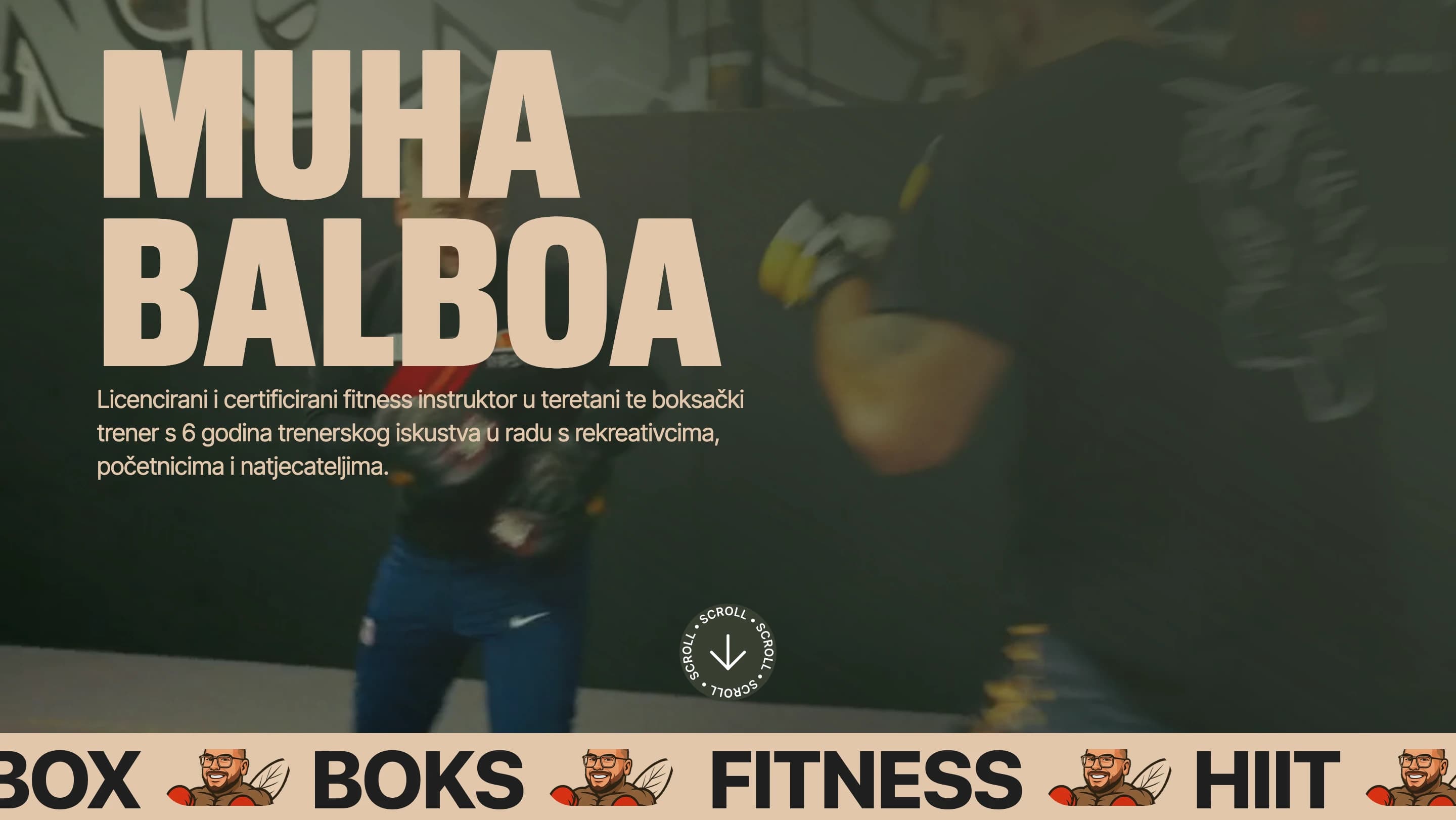
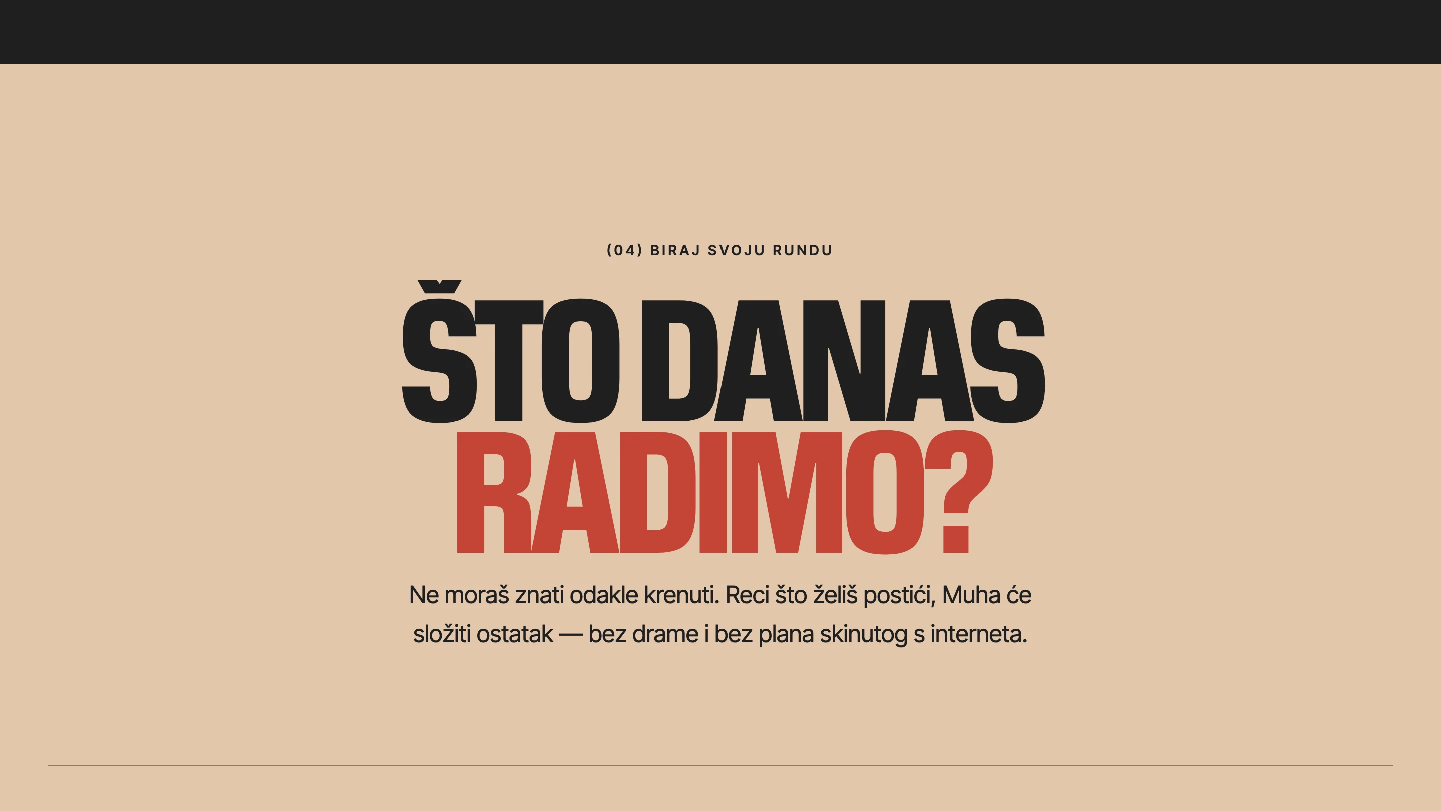
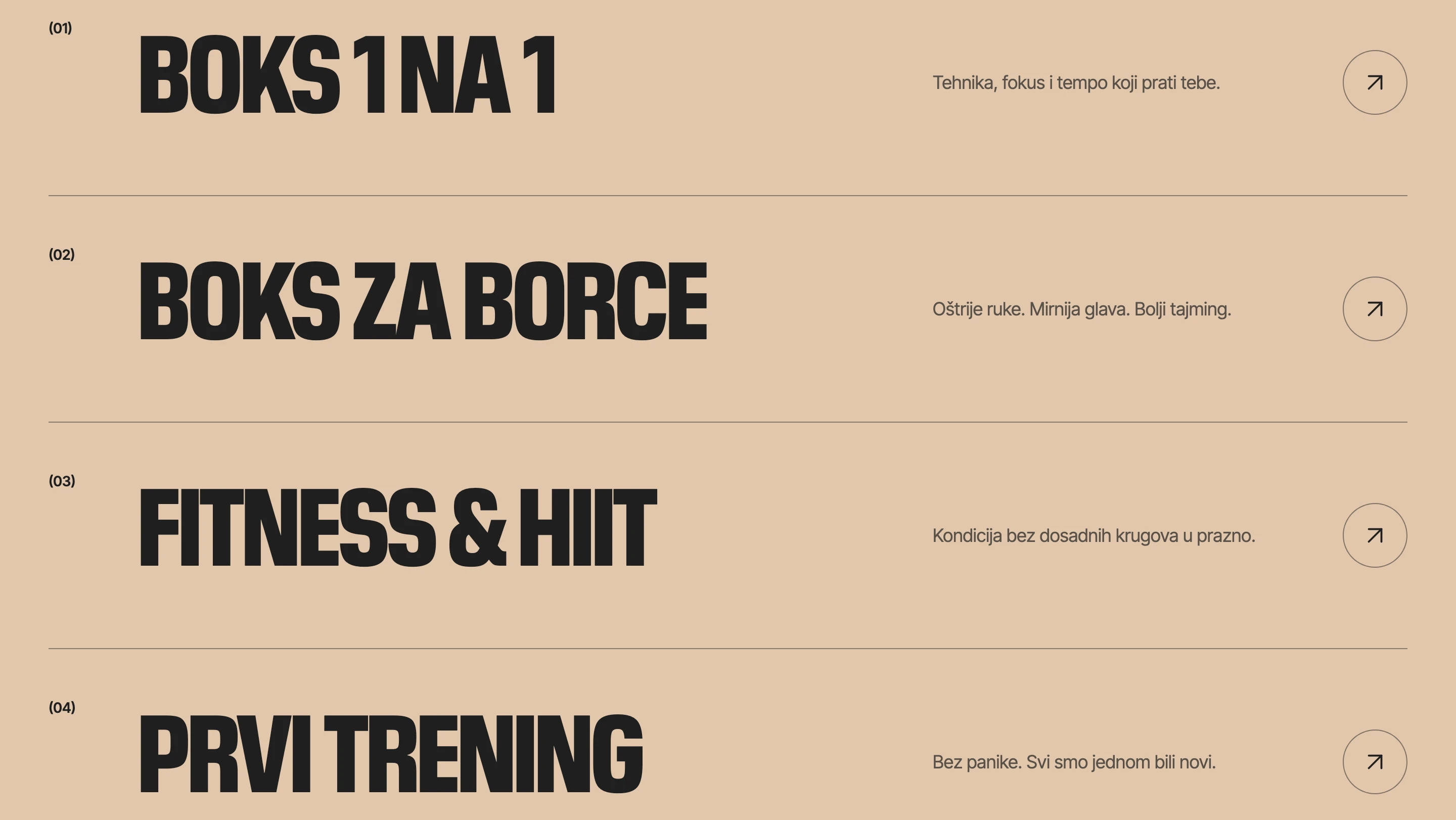
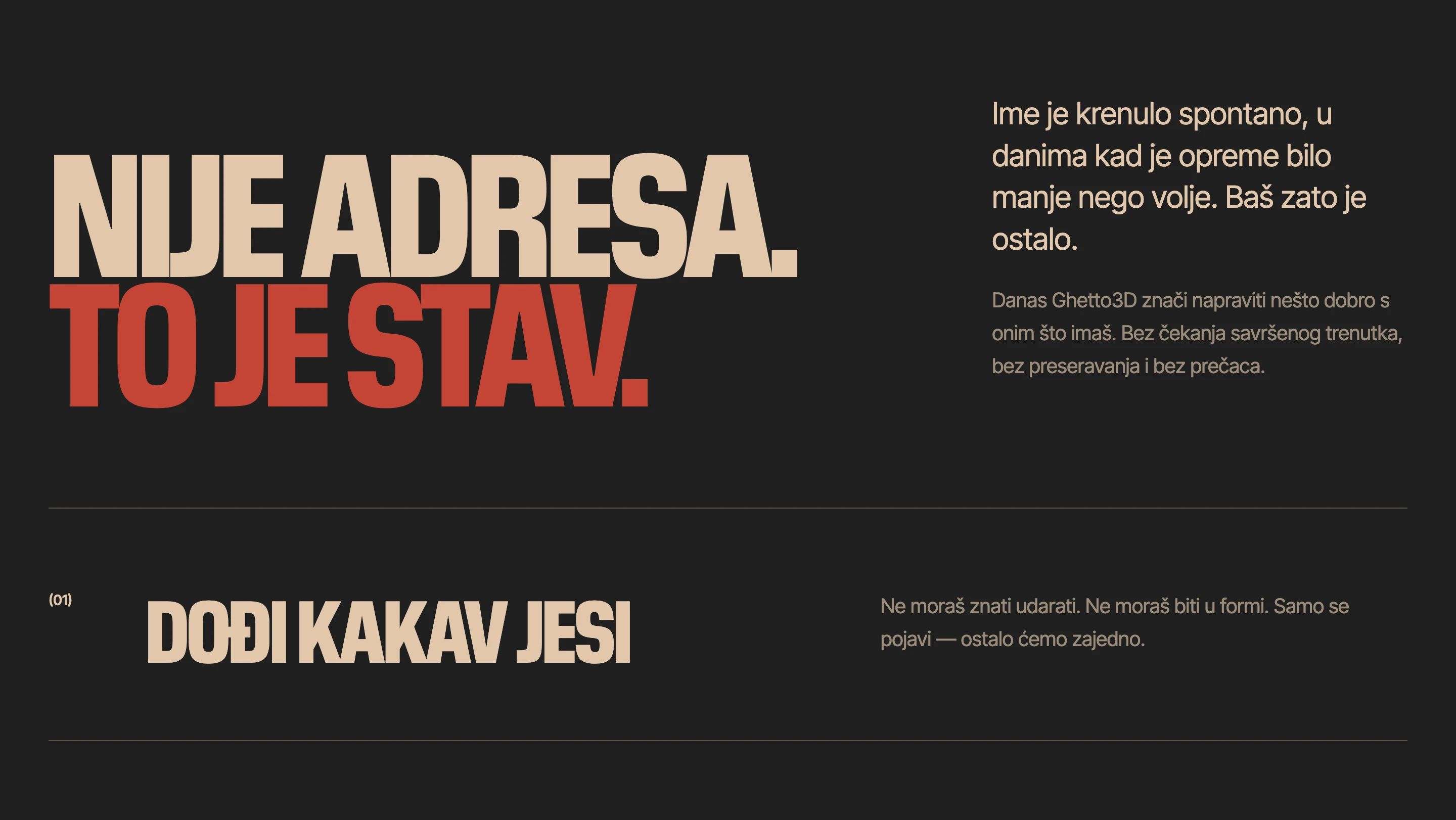
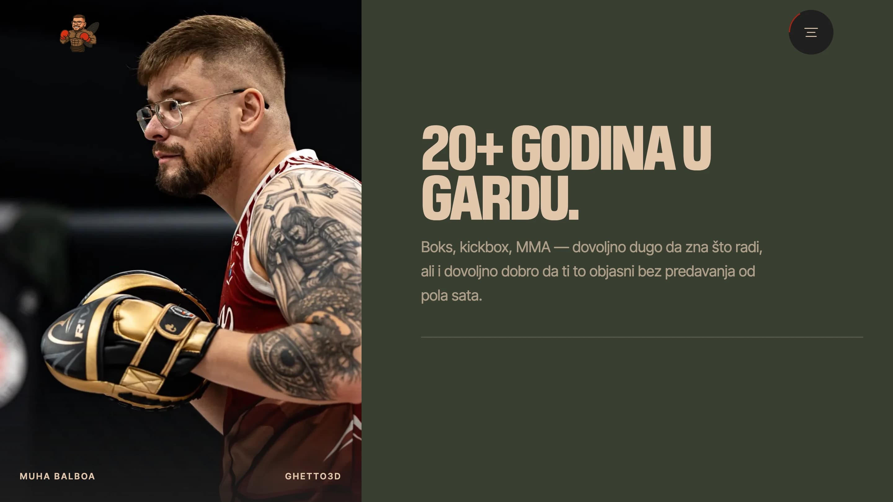
The one-page structure follows the rhythm of a round: setup, acceleration, recovery, repeat. Each section carries a single idea, expressed through short Croatian copy, oversized typography and documentary imagery from the gym. Visitors meet Muha, understand the Ghetto3D attitude, choose a training path and reach the contact point without leaving the flow.
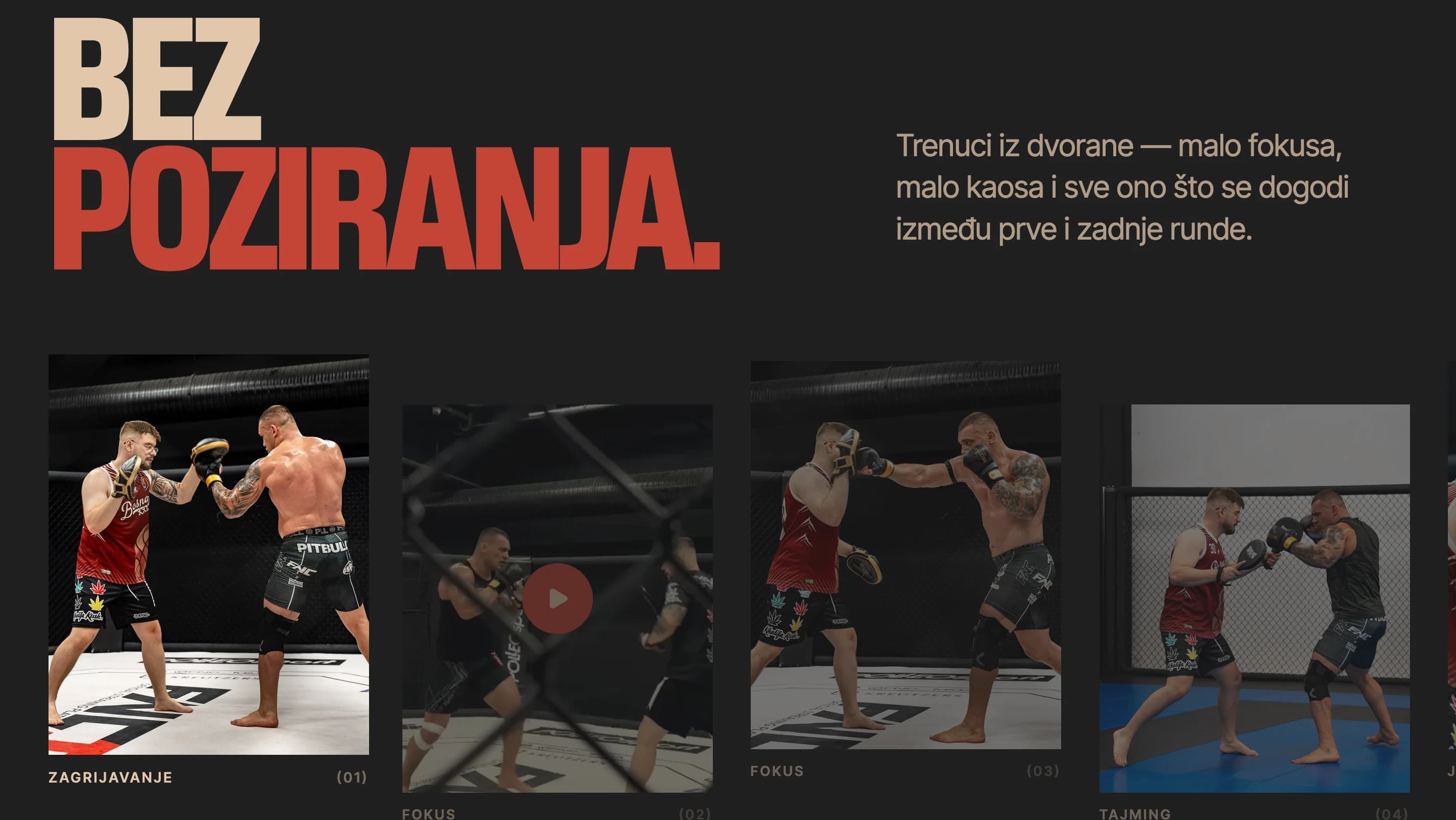
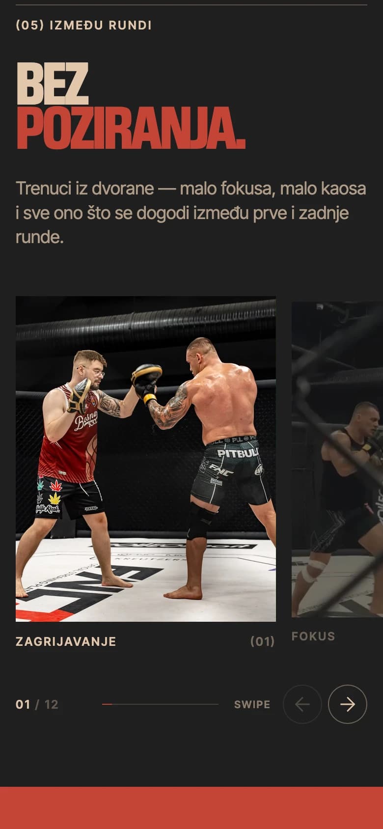
Motion supplies tempo rather than decoration. The opening film establishes atmosphere; tickers and velocity text create momentum; masked reveals and a circular menu mark transitions; and the draggable gallery slows the pace long enough for the real training culture to come through.
Warm enough to invite. Strong enough to fight.
Sand and ink carry most of the experience, replacing sterile white and absolute black with a warmer, more tactile contrast. Ring Green grounds photography and long dark sections; Fight Red is held back for active moments, emphasis and the lines that need to land hardest. Warm Tan bridges the intro into the main page, keeping the system physical without imitating a literal boxing gym.
- Warm Sand#E1C7AC
Primary ground and light typography
- Ink Black#1F1F1F
Display type, navigation and dark sections
- Fight Red#C44536
Emphasis, progress and interaction
- Ring Green#383E32
Secondary ground and image overlays
- Warm Tan#CEA780
Intro and transitional surfaces
Pure black and white are reserved for media masks, shadows and small icon details. The menu progress ring is normalized to the primary #C44536 red so the system keeps one intentional signal colour.
Impact, then control
The typography works as a two-part rhythm. Pilat Condensed brings the compression and force of a fight poster; Inter Tight keeps the smaller voice precise, contemporary and easy to scan. A neutral system sans is used only inside the moving marquee, where clarity matters more than brand theatre.
Oversized headlines, navigation, statements and calls to action
Body copy, labels, metadata, controls and supporting text
The main scrolling marquee
A cinematic surface with a lightweight core
Astro renders the essential story as resilient HTML, while focused interactive components take over only where the experience needs movement. GSAP and ScrollTrigger choreograph the hero, section reveals, menu transitions and horizontal moments without turning the page into one monolithic animation.
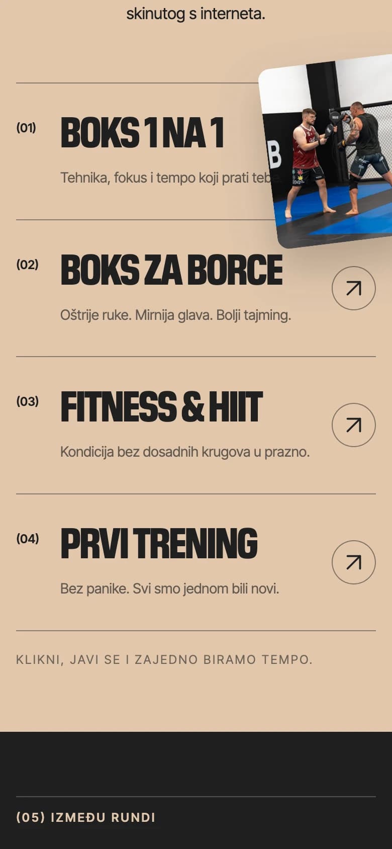
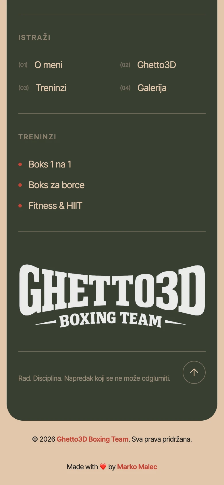
The interface keeps the same hierarchy on smaller screens instead of collapsing into a generic mobile layout. Type scales down, content reorders and the gallery becomes swipe-first, but the pace and visual confidence remain intact. Reduced-motion and keyboard-friendly controls keep the expressive layer from becoming a barrier.
Same corner. Smaller canvas.
Training paths, documentary gallery and the final contact remain direct on mobile — without losing the oversized type or the visual rhythm.
“The site needed to hit hard without ever making a beginner feel small.”
Marko Malec
A site that behaves like the coach it represents
The finished experience is direct, demanding and approachable in equal measure. Four training paths turn a broad offer into clear starting points, while the 12-part gallery gives the claims a documentary backbone instead of relying on polished campaign imagery alone.
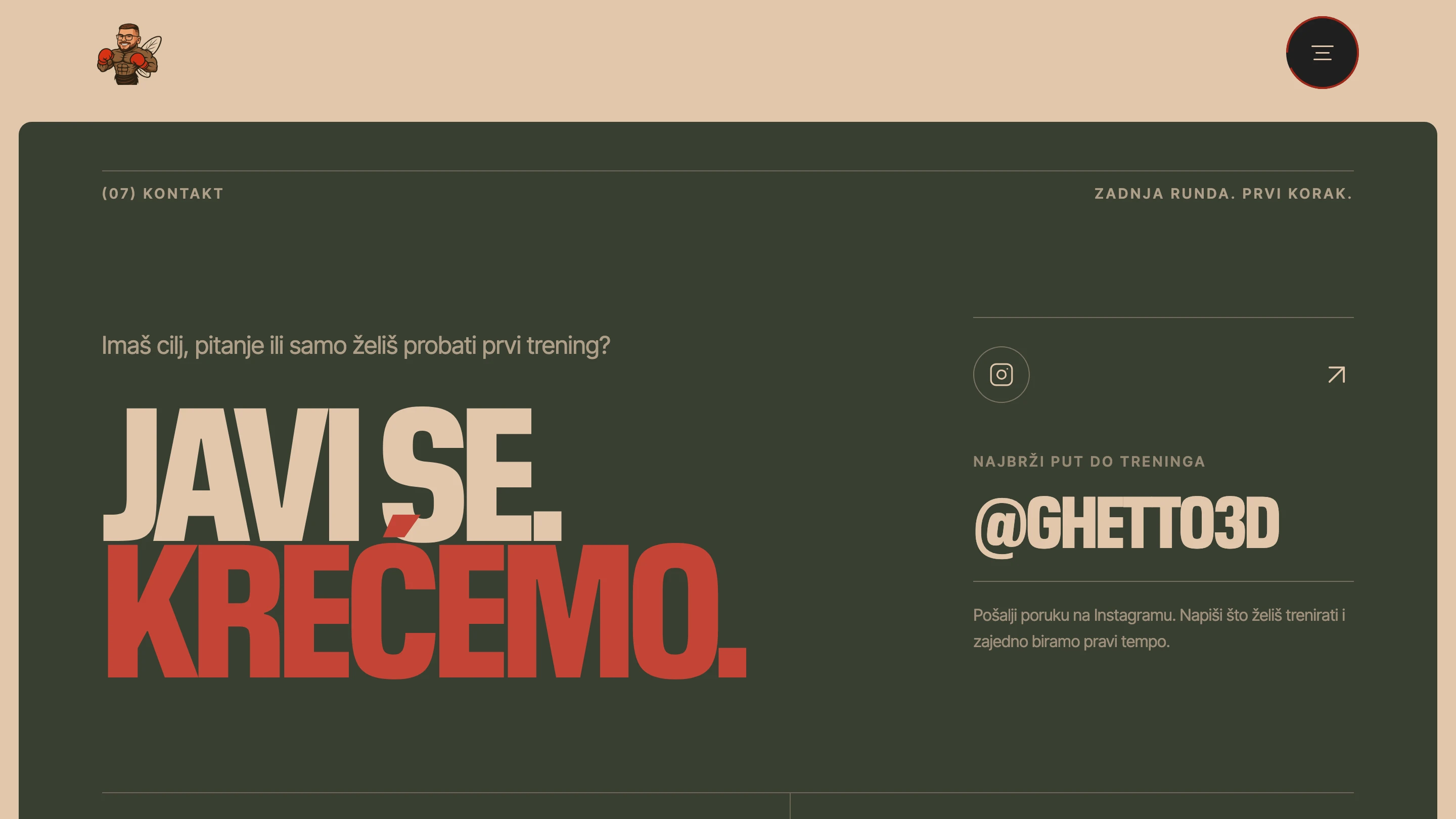
Most importantly, the final call to action does not overcomplicate the relationship. Visitors are invited to send a message, explain what they want to train and choose the right tempo together — the same personal approach the site establishes from its first frame.