A developer’s portfolio has to make a visual argument in seconds, then earn that confidence through speed, clarity, and detail. This one turns the interface itself into the proof.
- Client
- Self-initiated
- Role
- Creative direction, design & development
- Timeline
- 2026
- Team
- Independent project
- Live site
- markomalec.com ↗
- Stack
- React 19Vite 8Tailwind CSS 4GSAPLenisThree.js
Make restraint feel unmistakable
A personal portfolio is judged twice: once in the first few seconds, and again when someone slows down. The first judgment is emotional — does this person have a point of view? The second is forensic — does the work hold up when I look closely?
That created a useful contradiction. The site needed enough character to be remembered, but enough restraint for the projects to remain the reason to stay. Every section had to do one clear job: establish identity, express a point of view, show the work, explain the practice, reveal the person, or open a conversation.
Let typography carry the identity
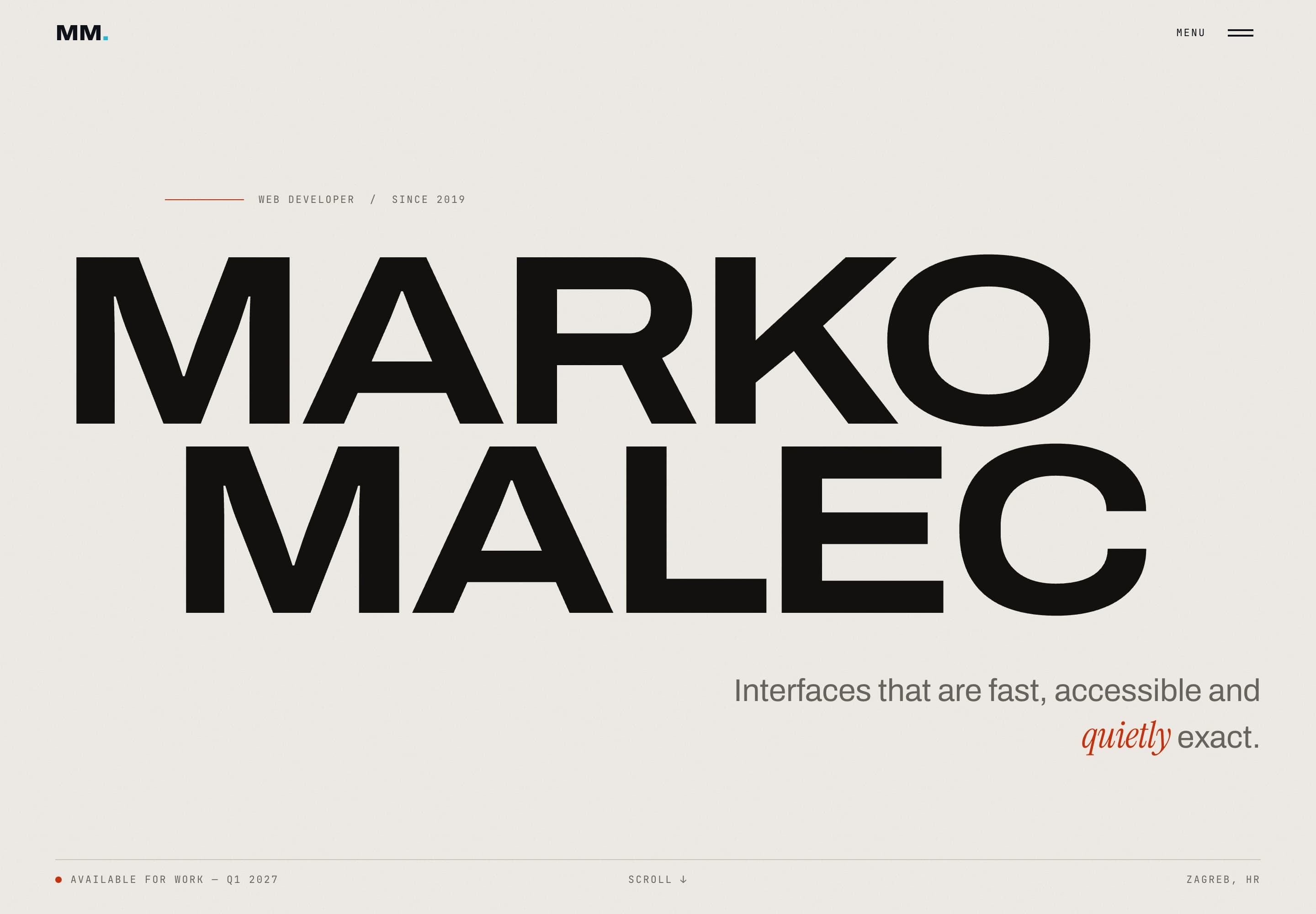
The visual system begins with scale, spacing, and a narrow palette rather than ornamental UI. Archivo supplies the structural voice: wide, compressed, heavy, and exact. Instrument Serif interrupts it at key moments with a more human cadence, while JetBrains Mono handles labels and metadata with deliberate neutrality.
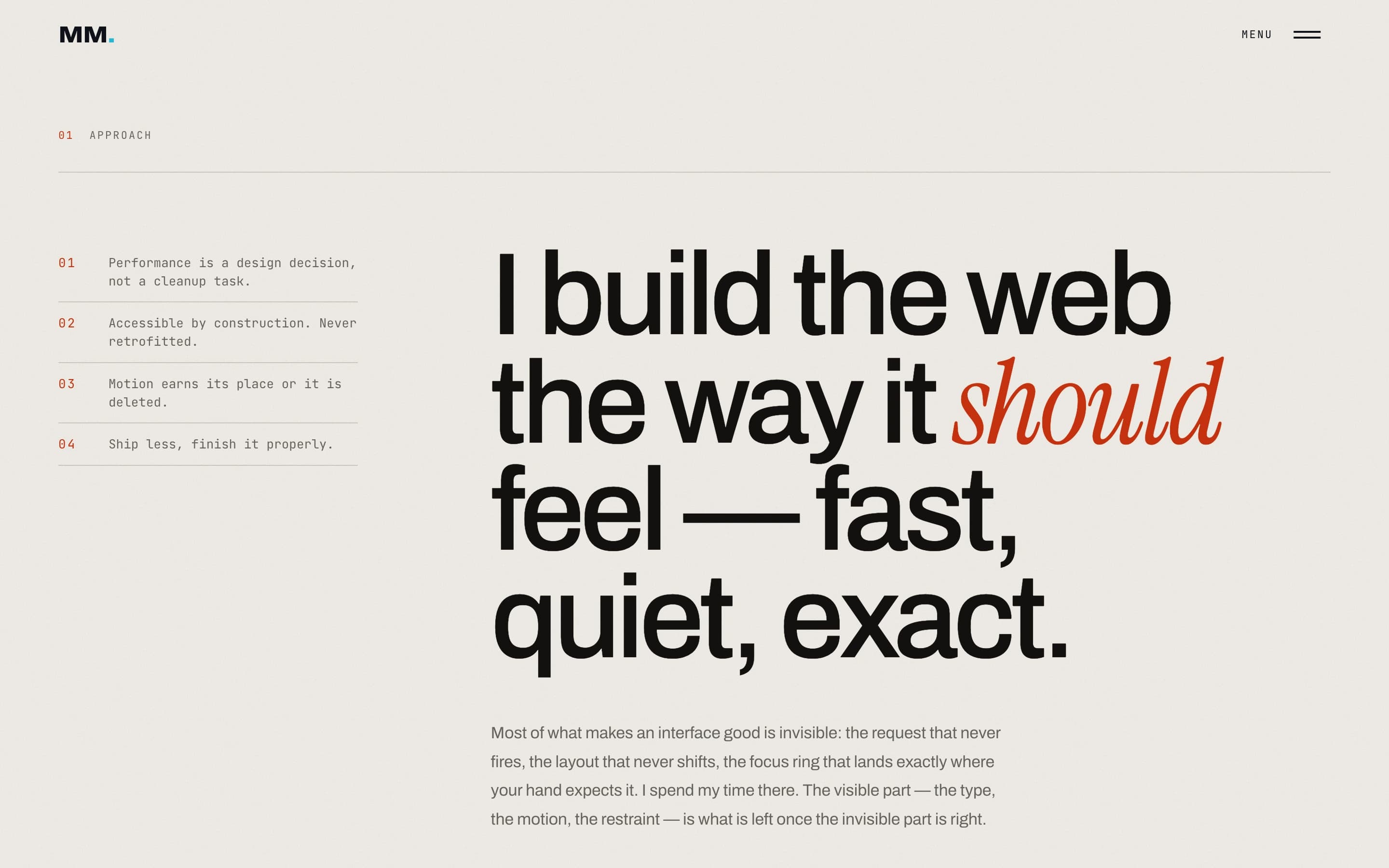
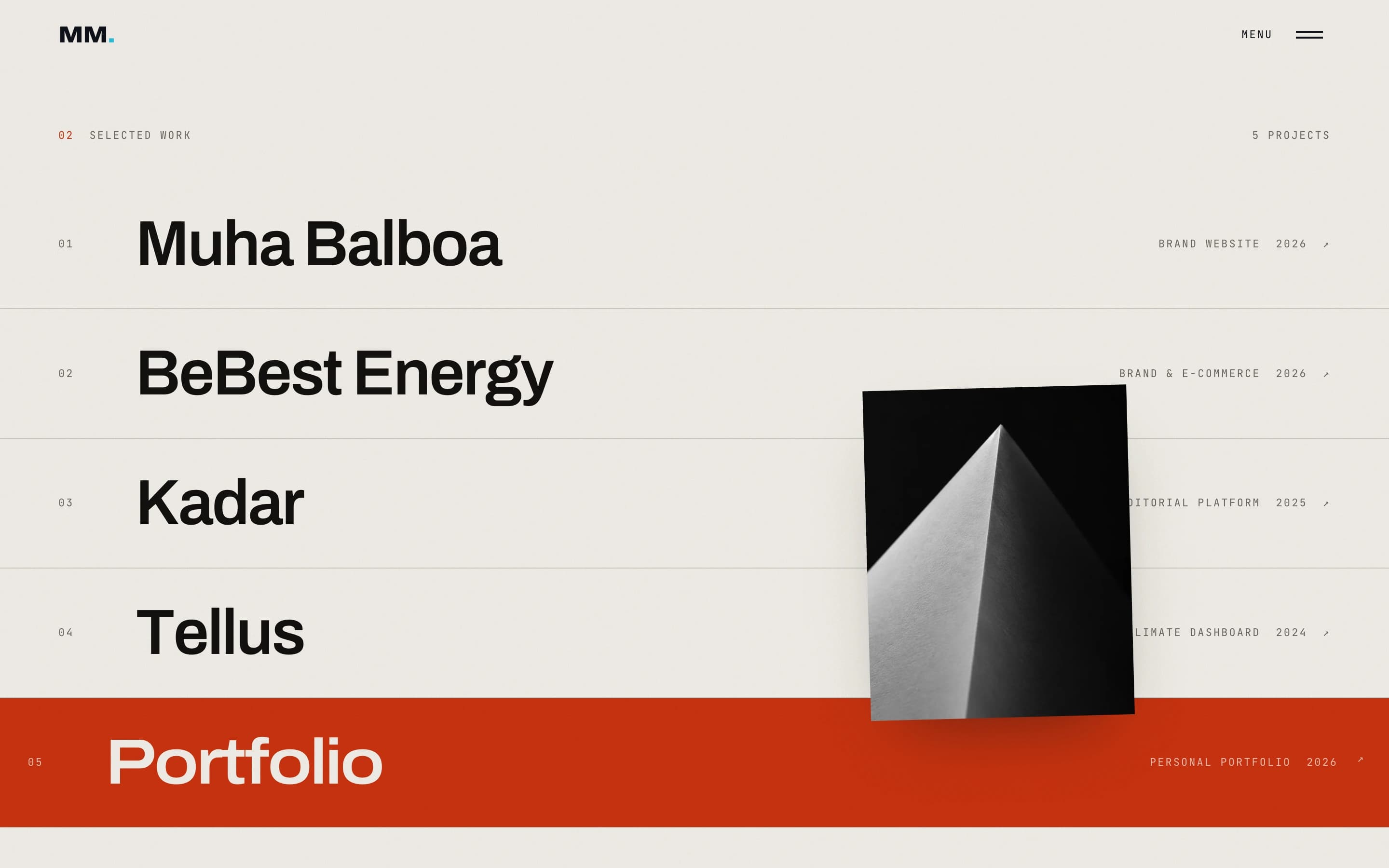
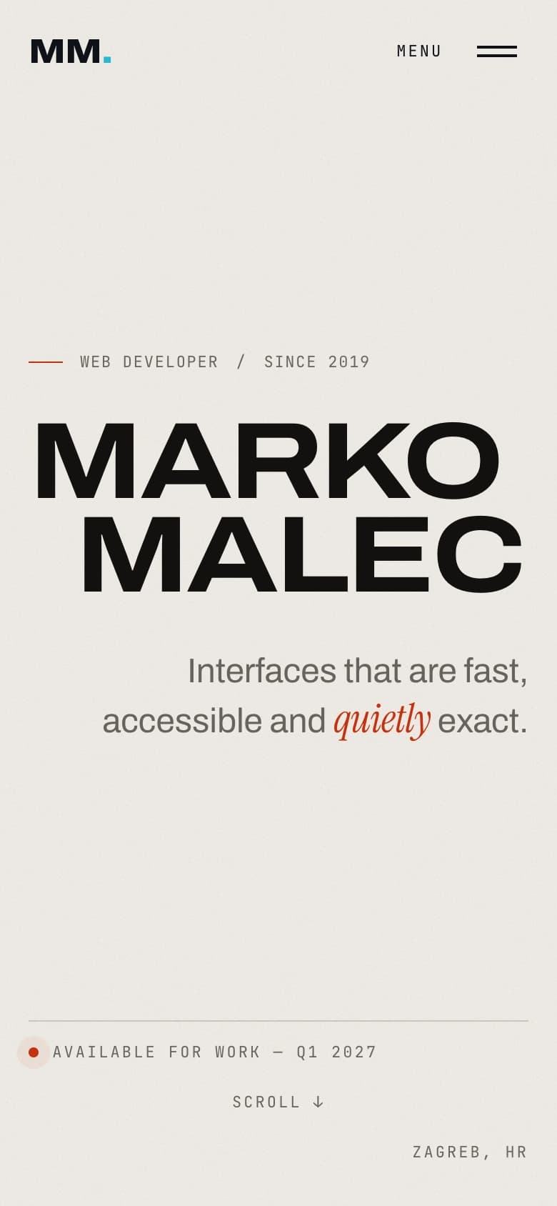
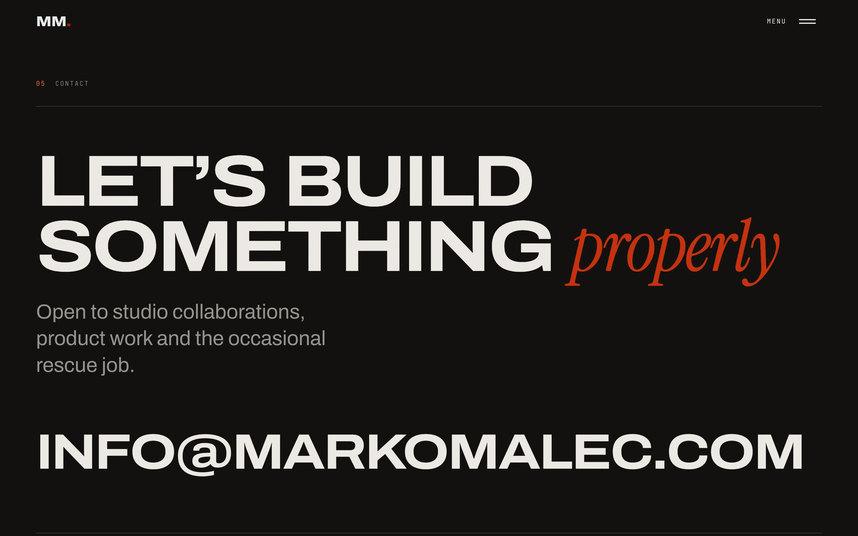
The home page reads like an editorial sequence. The name opens at architectural scale; the manifesto slows the pace; project rows compress five stories into a decisive index; the contact line ends with the largest and simplest invitation on the page. The rhythm changes, but the underlying grid never does.
Paper, ink, and one decisive signal
Warm neutrals give the interface the tactility of a printed object without imitating paper literally. Minium red is reserved for moments that need a pulse: active work, section markers, cursor feedback, and results. Because the accent is scarce, it stays meaningful.
- Warm paper#F0EDE6
The main canvas; softer and more tactile than pure white.
- Warm ink#14110F
Primary type, dark surfaces, and the strongest contrast.
- Minium#C8320F
Interaction, emphasis, and the project-by-project colour field.
- Sunk paper#E6E2D8
Subtle depth behind quiet interface regions.
- Raised paper#F6F4EF
A restrained lift for media and contained surfaces.
Minium red clears WCAG AA for normal text on warm paper at 4.58:1. The palette stays intentionally small so scale, type, and motion can do the expressive work.
Motion carries hierarchy
The entrance sequence reveals structure before spectacle: utility, wordmark, supporting information, then the live surface behind it. Page transitions use the same logic at route level, covering the view before content changes and resolving anchors while the screen is protected.
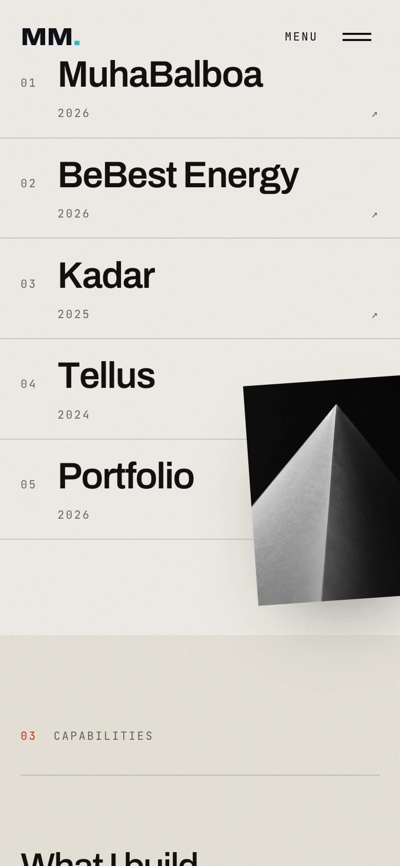
Selected Work is the most concentrated expression of the system. A project row reads instantly in its resting state; on pointer devices, its colour field enters from the same edge as the cursor and a large image follows the gesture. On touch screens, the corresponding image appears as each row crosses the reading zone, with enough of it held inside the viewport to remain legible while its right edge can breathe beyond the frame.
The expressive layer has to disappear gracefully
The site is built with React and Vite around a small set of durable primitives: a shared stage for loading and motion state, a route curtain, semantic reveal text, fluid type fitting, and reusable project data. A font-aware preloader prevents the opening composition from reflowing, while a short failsafe keeps a slow asset from holding the page hostage.
Animation never owns essential content. Reveal effects preserve a readable semantic source; focus states stay visible; keyboard navigation follows the visual order; and reduced-motion users receive an immediate, equivalent layout. The custom cursor is additive and only appears where a fine pointer exists.
WebGL is treated as an enhancement. The fluid hero and pigment fields pause when they leave the viewport, cap pixel density, and yield to static fallbacks when the device or preference calls for it. Each public route is also prerendered with its own title, description, canonical URL, and social image, so the experience remains discoverable before JavaScript runs.
SAME VOICE. DIFFERENT RHYTHM.
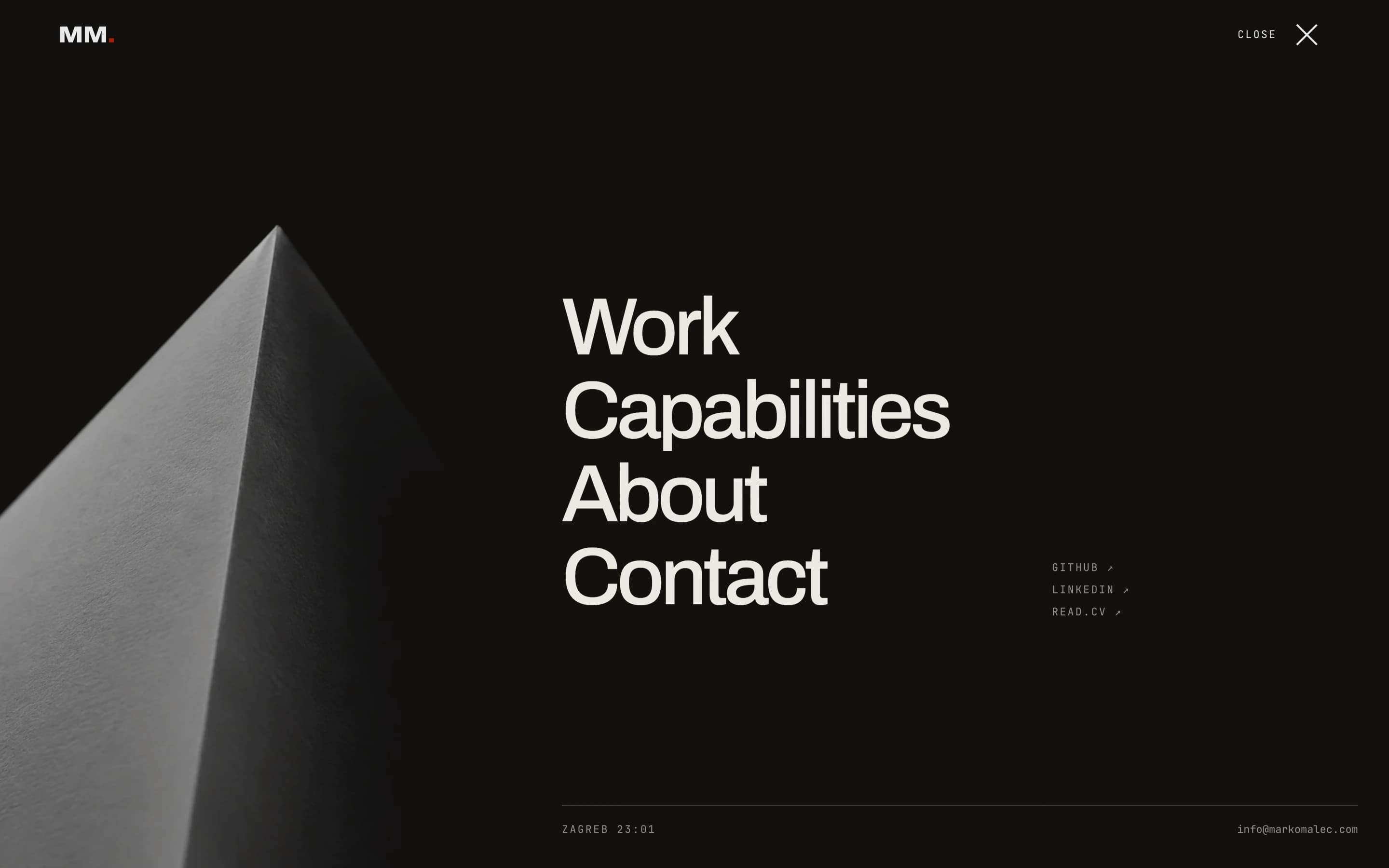
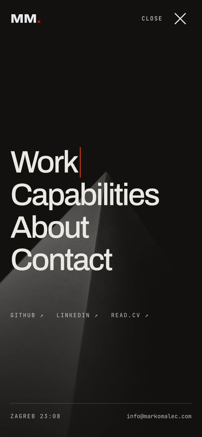
The mobile layout keeps the scale and confidence of the desktop composition, then changes the choreography for touch: tighter reading lengths, viewport-led previews, and an overlay that becomes a full vertical scene.
“The portfolio could not simply claim that detail matters. Every transition, focus state, and loading decision had to make the claim visible.”
Marko Malec
A portfolio that behaves like the work it represents
The finished site forms one continuous argument: identity, point of view, proof, capability, person, and invitation. Each section changes the pace without breaking the visual language, and every project can borrow its own colour and imagery while still belonging to the same editorial system.
More than a gallery, the portfolio is a working demonstration of the practice behind it — expressive where expression has a purpose, quiet where the content needs room, and exact in the details people feel before they notice them.